様々なデバイスサイズがあるので、ブレイクポイントの設定って結構迷いがちなんじゃないかなってことで、「Bootstrap v5.0」に記載されていたブレイクポイントを参考に、CSSでの記述を書いてみました!(自分用のメモとしてw)
▼デモページ
DEMO
Bootstrap v5.0のブレイクポイント
以下の画像はBootstrapのブレイクポイントについて解説してあるページのキャプチャ画像です。
この数値を参考にCSSを書いていきたいと思います!
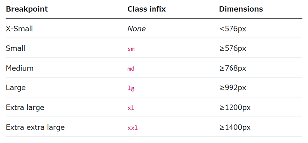
▼Breakpoints · Bootstrap v5.0
https://getbootstrap.com/docs/5.0/layout/breakpoints/#available-breakpoints
CSSでの記述
HTMLファイルにstyleタグを使って書いてみました。
ウィンドウの幅に合わせて、現在どのブレイクポイントが該当しているのか分かるようテキストが変化するようになってます。
▼デモページ
DEMO
<!DOCTYPE html>
<html lang="en">
<head>
  <meta charset="UTF-8">
  <meta http-equiv="X-UA-Compatible" content="IE=edge">
  <meta name="viewport" content="width=device-width, initial-scale=1.0">
  <title>【CSS】ブレイクポイント</title>
</head>
<body>
  <div>
    <p>▼現在のブレイクポイント</p>
  </div>
<style>
p::after{
  display: block;
}
@media only screen and (max-width: 575px) { /* 575px以下 */
  p::after{
    content: '575px以下★@media only screen and (max-width: 575px)';
  }
}
@media only screen and (min-width: 576px) { /* 576px以上 */
  p::after{
    content: '576px以上★@media only screen and (min-width: 576px)';
  }
}
@media only screen and (min-width: 768px) { /* 768px以上 */
  p::after{
    content: '768px以上★@media only screen and (min-width: 768px)';
  }
}
@media only screen and (min-width: 992px) { /* 992px以上 */
  p::after{
    content: '992px以上★@media only screen and (min-width: 992px)';
  }
}
@media only screen and (min-width: 1200px) { /* 1200px以上 */
  p::after{
    content: '1200px以上★@media only screen and (min-width: 1200px)';
  }
}
@media only screen and (min-width: 1400px) { /* 1400px以上 */
  p::after{
    content: '1400px以上★@media only screen and (min-width: 1400px)';
  }
}
</style>

</body>
</html>